Introduction
In CSS, grid layout is used to create a responsive web design grid layout consistently across browsers of different screen sizes. In the past, creating responsive layouts for web pages was such a complex and challenging task that involve using tables as a layout container, heavy use of float or creating custom css layouts for various display sizes.
CSS grid helps create more robust, flexible and responsive layouts much easier than the previous options that invlove complicated workarounds. All major browsers
Example
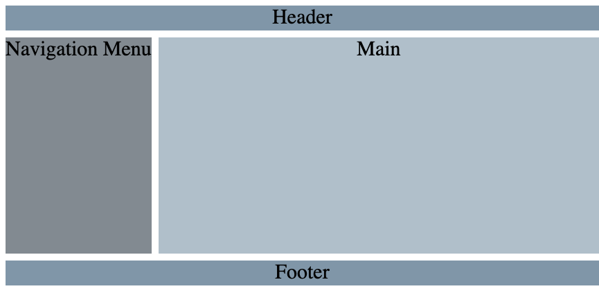
The following is an example of a two-column layout with a navigation sidebar to the left and content in the middle with equal height columns. Additionaly, there should be a header on the top and a footer on the bootom. This is a common layout structure for a web page. This layout can be done in various ways. We will use CSS grdis with grid-template-areas.
    <div id="wrapper">
        <header>Header</header>
        <nav>Navigation Menu</nav>
        <main>Main</main>
        <footer>Footer</footer>
    </div>
html, body {
    width: 100%;
    height: 100%;
    text-align: center;
    font-size: 30px;
}

#wrapper {
    display: grid;
    min-height: 100%;
    gap: 10px;
    grid-template-rows: auto 1fr auto;
    grid-template-columns: auto 1fr;
    grid-template-areas:
        "head head"
        "nav  main"
        "foot  foot";
}

header {
    grid-area: head;
    background-color: #8096a8;
}

nav {
    grid-area: nav;
    background-color: #828a91;
}

main {
    grid-area: main;
    background-color: #b0bfca;
}

footer {
    grid-area: foot;
    background-color: #8096a8;
}
Output
For more information, see CSS Grids on MDN ↗