Absolute length units
Absolute length units are often considered to always be the same size. Some of the most useful CSS absolute units are listed below:
px: Pixels. 1px = 1/96th of 1in.- This unit is not an actual physical pixel. It’s amagical unit whose value varies by hardware and resolution. The size of 1px depends on the type of device and meant to be small but visible.
cm: Centimeters. 1cm = 37.8px = 25.2/64inin: Inches. 1in = 2.54cm = 96ppt: Points. 1pt = 1/72th of 1 in.- This unit is often used for printed documents or ink-on-paper typography. Thus, it’s often used with the
font-sizeproperty when creating a custom style for printers. For example, one may create a special CSS for printing only as<link rel="stylesheet" media="print" href="print.css" />
- This unit is often used for printed documents or ink-on-paper typography. Thus, it’s often used with the
<div class="box-1">
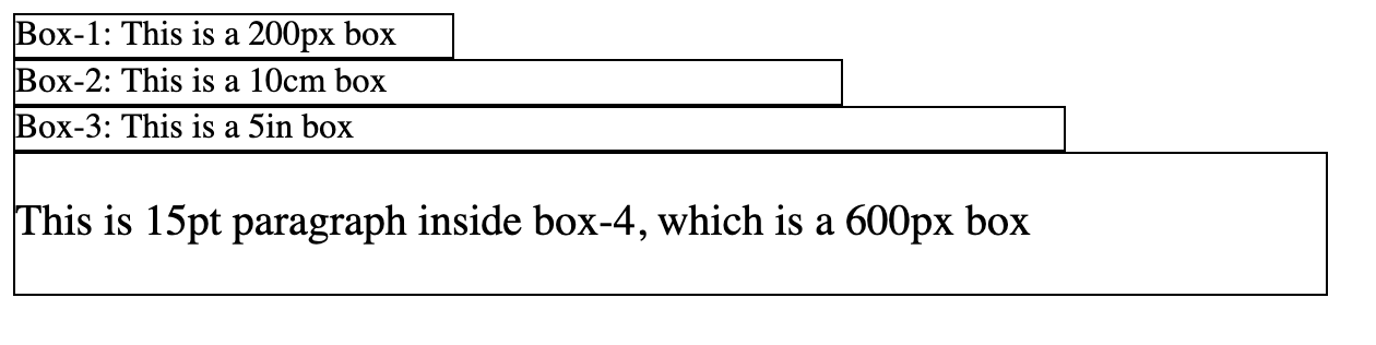
Box-1: This is a 200px box
</div>
<div class="box-2">
Box-2: This is a 10cm box
</div>
<div class="box-3">
Box-3: This is a 5in box
</div>
<div class="box-4">
<p>This is 15pt paragraph inside box-4, which is a 600px box</p>
</div>
div{
  border: 1px solid black;
}
.box-1{
  width: 200px;
}
.box-2{
  width: 10cm;
}
.box-3{
  width: 5in;
}
.box-4{
   width: 600px;
}
p{
  font-size: 15pt;
}
Relative length units
Relative length units are relative to something (e.g., the size of the parent element, or the parent element’s font or the size of the viewport). These units are very helpful when designing web pages that will be rendered on devices of various screens. They will scale relative to everything on the page. Some of the most useful CSS absolute units are listed below:
- Percentages
%- A percentage that is relative to some other value. For example, if an element has
font-size:20%, it will be 20% of the font-size of the element’s parent. Similarly, if an element haswidth:20%, it will be 20% of the width of the element’s parent.
- A percentage that is relative to some other value. For example, if an element has
vw- 1% of the viewport’s width.
vh- 1% of the viewport’s height.
em- Relative to font size of the parent (e.g., font-size) and font size of the element itself (e.g., width).
rem- Relative to font size of the root element.
Example: percentages (%) vs viewports (vw vh)
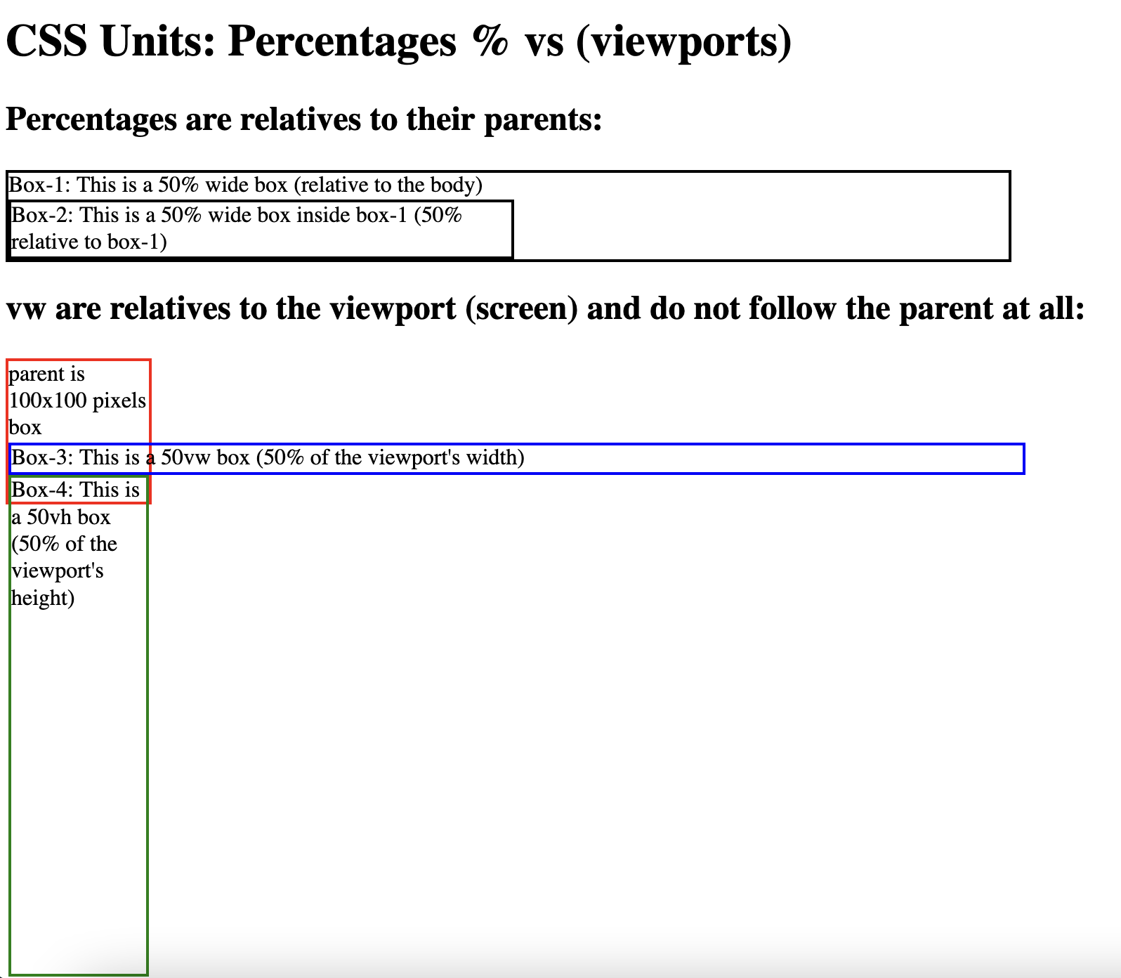
Percentages are relative to the size of the parent element and viewports are relative to the size of the viewport.
    <h1>CSS Units: Percentages % vs (viewports)</h1>
    <h2>Percentages are relatives to their parents:</h2>
    <div class="box-1">
        Box-1: This is a 50% wide box (relative to the body)
        <div class="box-2">
            Box-2: This is a 50% wide box inside box-1 (50% relative to box-1)
        </div>
    </div>
    <h2>vw are relatives to the viewport (screen) and do not follow the parent at all:</h2>
    <div class="parent">
        parent is 100x100 pixels box
        <div class="box-3">
            Box-3: This is a 50vw box (50% of the viewport's width)
        </div>
        <div class="box-4">
            Box-4: This is a 50vh box (50% of the viewport's height)
        </div>
    </div>
div{
  border: 2px solid black;
}
.box-1{
  width: 50%;
}
.box-2{
  width: 50%;
}
.parent{
  width:100px;
  height: 100px;
  border-color: red;
}
.box-3{
  width: 50vw;
  border-color: blue;
}
.box-4{
  height: 50vh;
  border-color: green;
}
Example: rem vs em
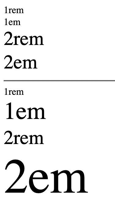
Both rem and em are relative to the defined font size. rem is relative the root’s font size while rm is relative to the parent’s font size.
The following HTML code has <div> elements with rem and em font size units:
<body>
    <div class="one-rem">1rem</div>
    <div class="one-em">1em</div>
    <div class="two-rem">2rem</div>
    <div class="two-em">2em</div>
    <hr>
    <div class="parent">
        <div class="one-rem">1rem</div>
        <div class="one-em">1em</div>
        <div class="two-rem">2rem</div>
        <div class="two-em">2em</div>
    </div>
</body>
.parent{
    font-size: 40px;
}
.one-em{
    font-size: 1em;
}
.one-rem{
    font-size: 1rem;
}
.two-em{
    font-size: 2em;
}
.two-rem{
    font-size: 2rem;
}
In the first set of elements, the parent element is the root element, which is <body> tag. Here both rem and em look exactly the same becuase rem is relative to the root element, which is <body>, and em is relative to the parent element, which is also <body>
In the second set of elements, the parent element is <div class="parent">. Here rem is relative to the root element, which is <body>, while em is relative to the parent element, which is also <div class="parent">.
Below is the output:
For the more information on CSS units, see MDN CSS values and units ↗.